Devlog 8:Value card design
Some card design references.
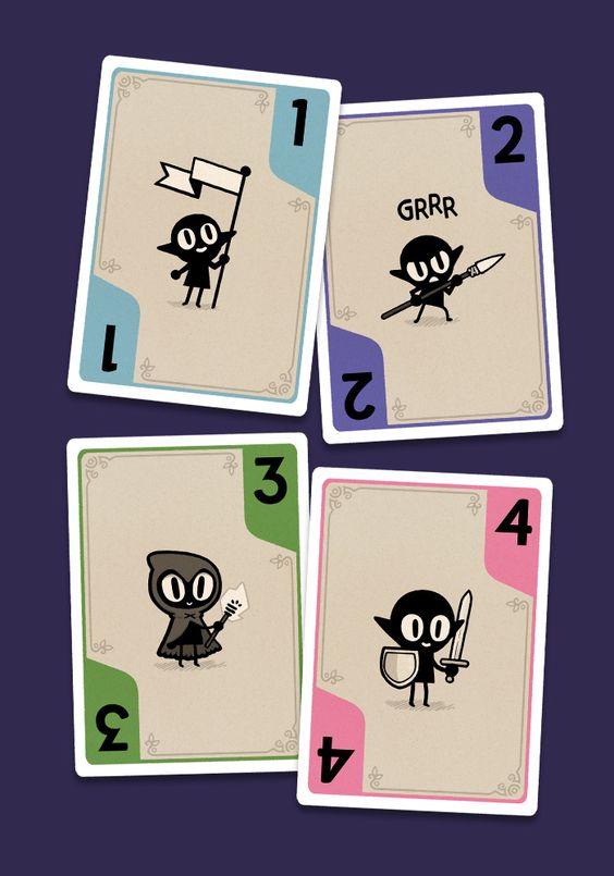
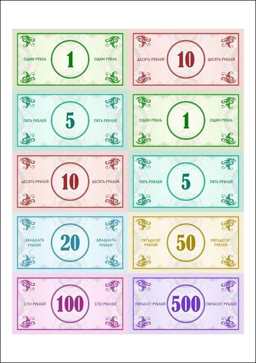
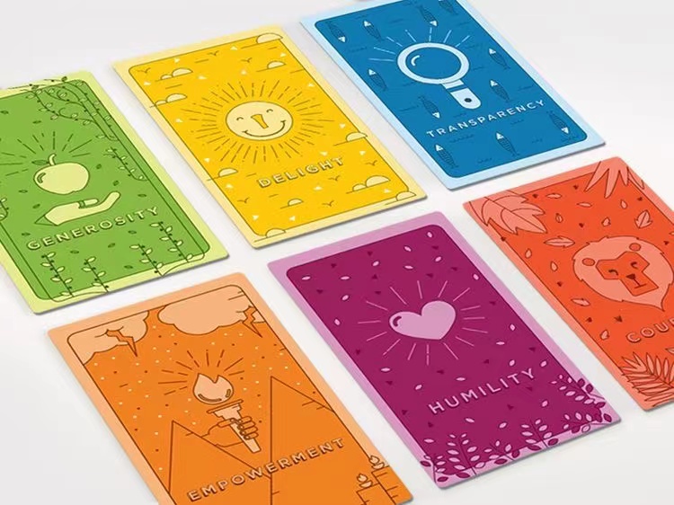
Carried out the design layout of the front of the card.

We initially wanted to use an emoji to express the emotion of each score value, but no matter how we laid out the emoji it stood out, and when the score was negative the crying face and cold tones made the card look scary. So, we decided to replace the emoji with a heart.

In the end, we decided on the third typography. This makes the cards clearer, and neater and allows the player to understand the score of the card at a glance.
Carried out the design layout of the back of the card.
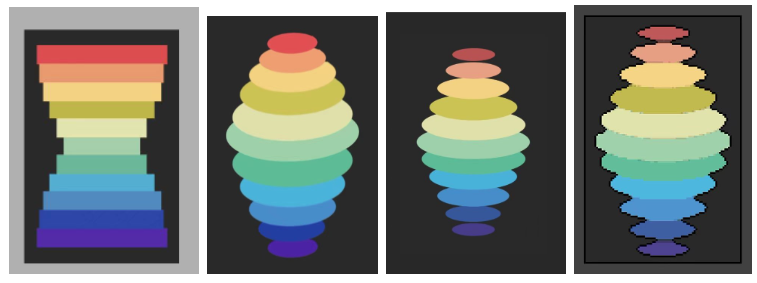
We ended up using a fourth typographic scheme, using 11 colours to represent the changes in emotional energy values across all the events and a more spread-out layout to make them look less bulky. Finally, we added a box around the cards, which gave them a more polished look.
The final deck of all the scores is shown below.

All the references can be found in the link below:
Get Emotion Kills Emotion Heals
Emotion Kills Emotion Heals
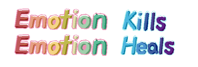
Emotion Kills, Emotion Heals is a board game for 2-4 players based on the theme of people's everyday emotions.
| Status | Released |
| Category | Physical game |
| Author | zsh811 |
| Tags | Board Game, Pixel Art |
More posts
- Devlog 11:PrintApr 30, 2022
- Devlog 10:Booklet designApr 30, 2022
- Devlog 9:Map design & Logo designApr 30, 2022
- Devlog 7:Event card designApr 30, 2022
- Devlog 6:Character Chess DesignApr 25, 2022
- Devlog 5:Mood settingApr 25, 2022
- Devlog 4:Events settingApr 24, 2022
- Devlog 3:Prototype & PlaytestApr 24, 2022
- Devlog 2:Initial game designApr 24, 2022
Leave a comment
Log in with itch.io to leave a comment.