Devlog 7:Event card design
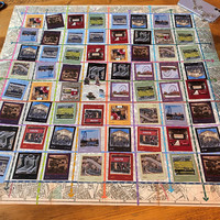
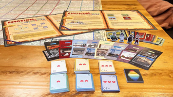
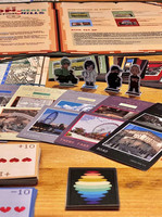
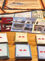
As the background of the game is the events of a day in the player's life and the corresponding emotions, the cards were inspired by Polaroid photographs taken during life.
Each photo is a record of what is happening at the time, so we chose to use the photos as the art style for the event cards.
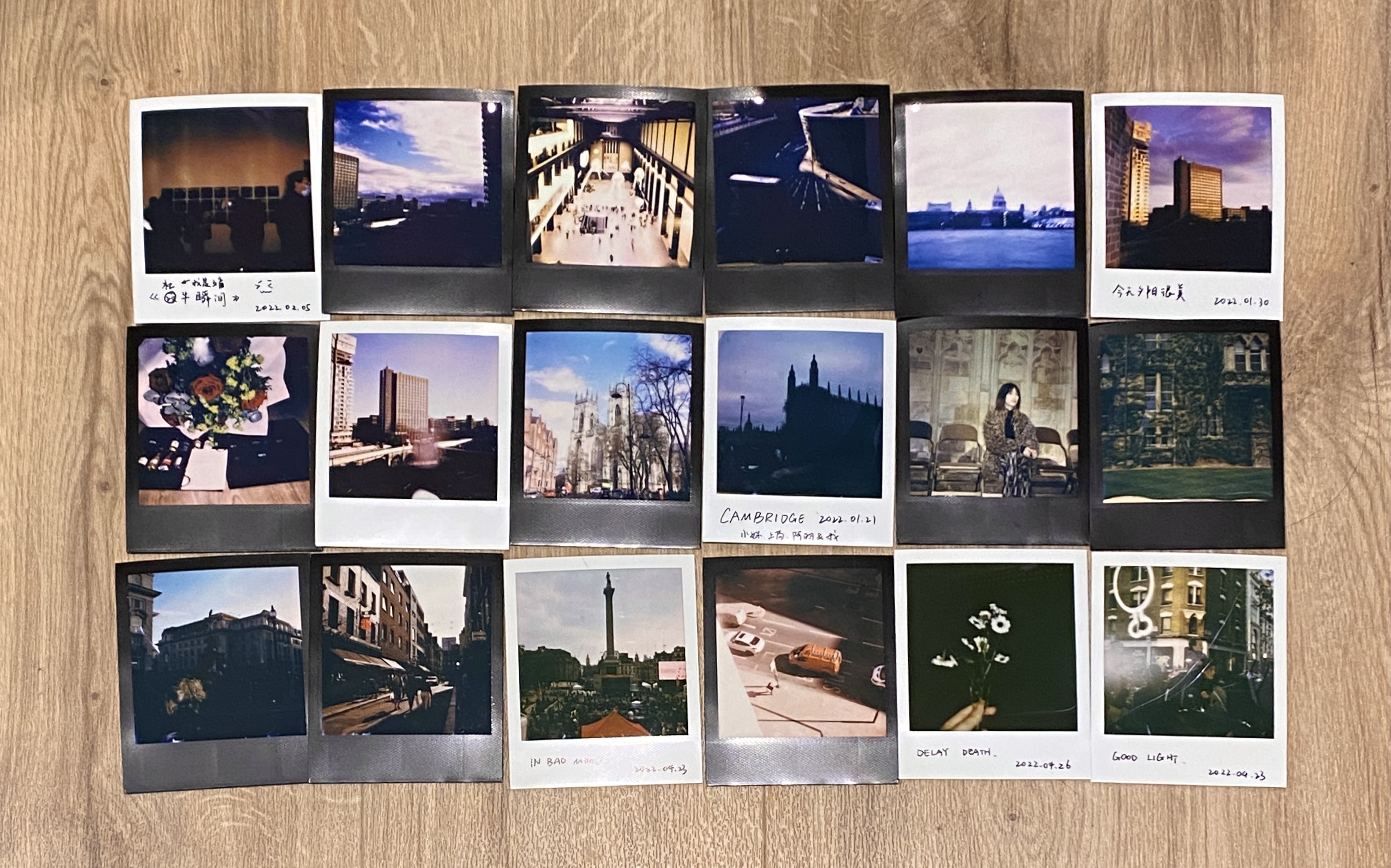
Some card design references.
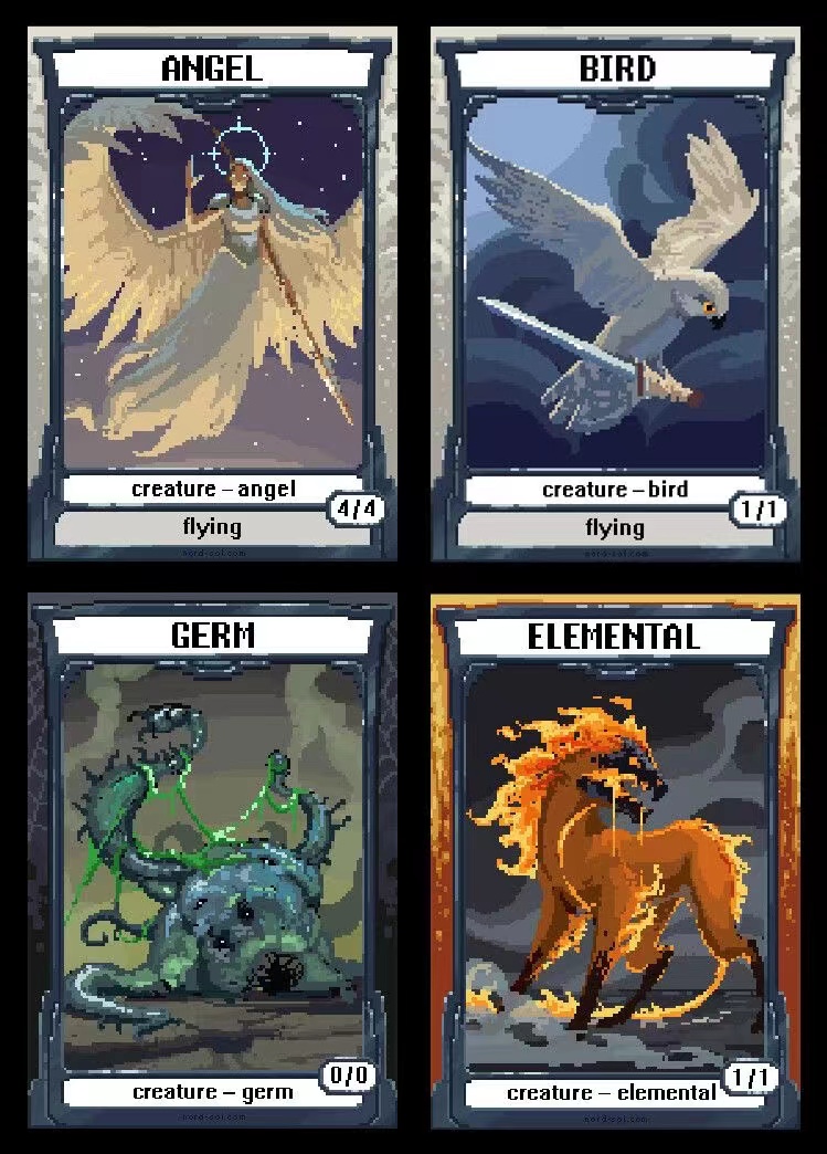
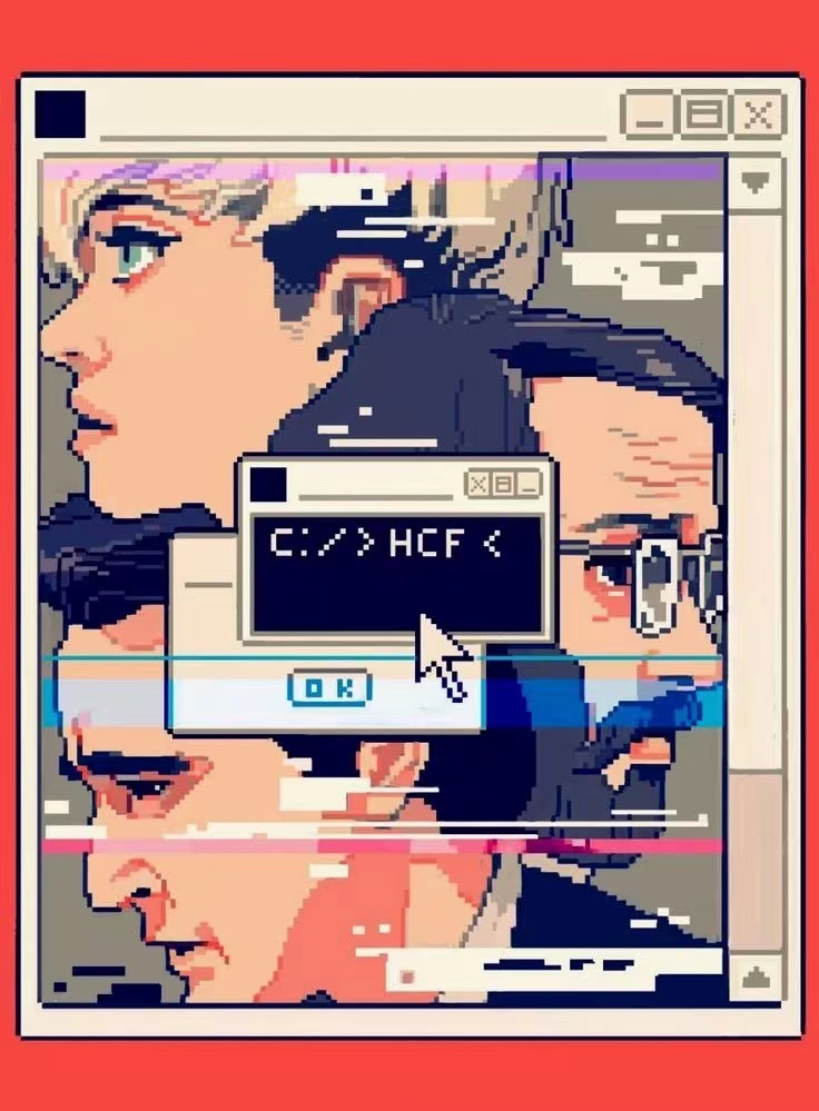
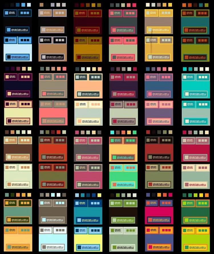
Design ideas
We combined Polaroid photos with a pixelated style, with the event cards showing the location of the event on the front and the specific event and the corresponding emotion on the reverse. Considering that the final game play requires a lot of cards to be laid out, we decided to make the cards smaller.
(Event Card 6x7cm,Value Card 4x6cm)

Most of the images involved in the event came from photos we had taken, and we used the app PixelMe to convert the images into pixel style images.
Design process

In the end, the third typography was chosen, which looks relatively sophisticated on the card and also reflects the picture as the main part.
Carried out the design layout of the back of the card.

The fourth typography was chosen in the end. Because some of the cards in the event cards are special collective events, we moved the normal event descriptions to the top of the cards and removed the cumbersome parts of the cards in order to make the event hints for these cards more visible.
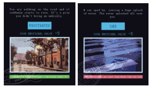 ( Layout of special group event cards )
We divided the locations of the events into categories and used different colour schemes to make the cards more in keeping with the style of the location.
The final design of all the cards is shown below.

All the references can be found in the link below:
Files
Get Emotion Kills Emotion Heals
Emotion Kills Emotion Heals
Emotion Kills, Emotion Heals is a board game for 2-4 players based on the theme of people's everyday emotions.
| Status | Released |
| Category | Physical game |
| Author | zsh811 |
| Tags | Board Game, Pixel Art |
More posts
- Devlog 11:PrintApr 30, 2022
- Devlog 10:Booklet designApr 30, 2022
- Devlog 9:Map design & Logo designApr 30, 2022
- Devlog 8:Value card designApr 30, 2022
- Devlog 6:Character Chess DesignApr 25, 2022
- Devlog 5:Mood settingApr 25, 2022
- Devlog 4:Events settingApr 24, 2022
- Devlog 3:Prototype & PlaytestApr 24, 2022
- Devlog 2:Initial game designApr 24, 2022
Leave a comment
Log in with itch.io to leave a comment.